1. Choropleth
What is a Choropleth?
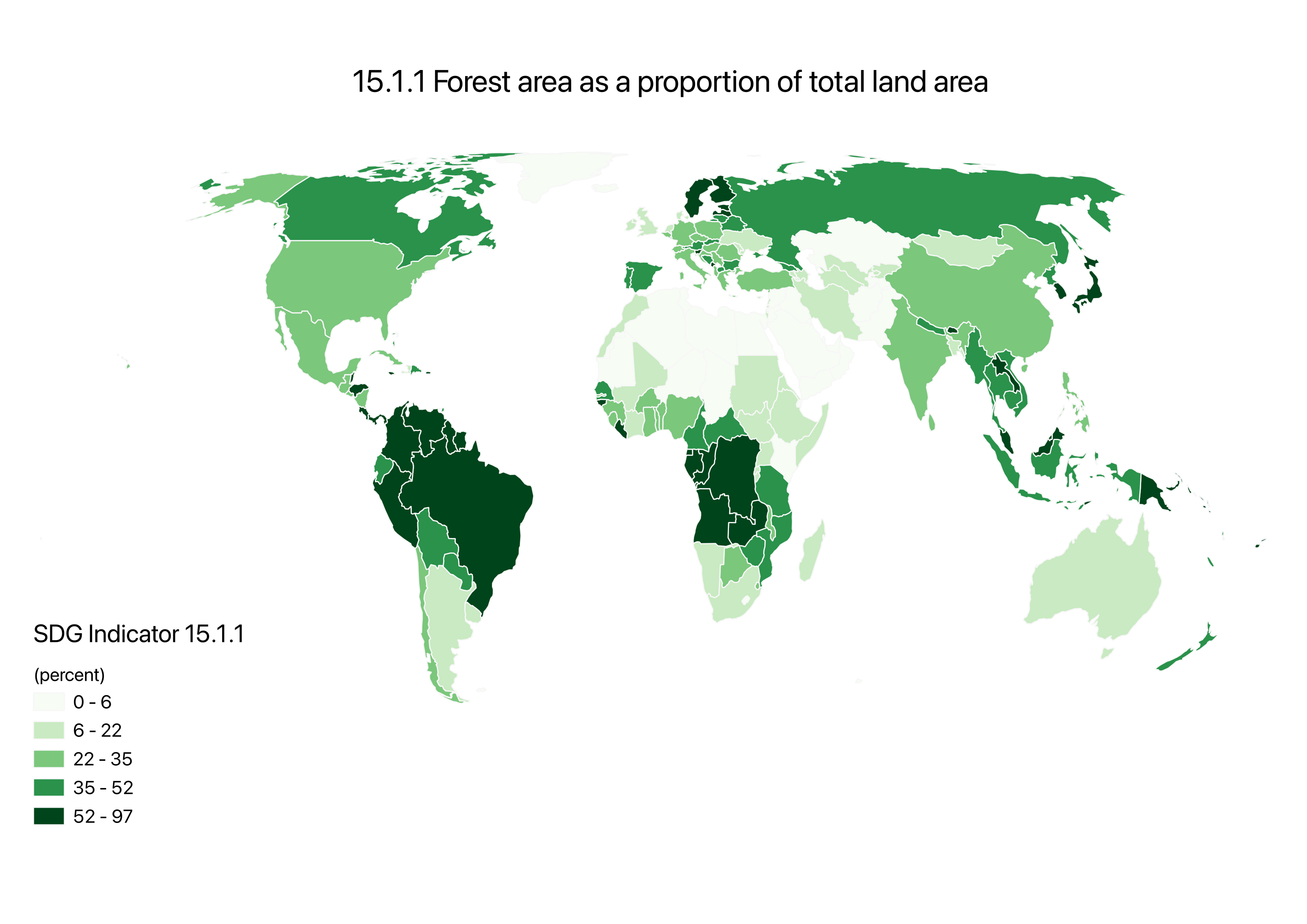
A choropleth is a thematic map that uses hierarchy of color (and sometimes size) to represent a range of data on a global scale and compare data between countries through a normalized indicator. Some benefits include that it is really simple to make and to interpret, which is why it is a common map among media. Some drawbacks, though, can be seen in the precision of the data. The data is generalized over a large land area, leading to lack of specificity. Additionally, only a certain type of data is accurately comparable between countries – percent data – limiting mapping options.
For this assignment, we were challenged to create a choropleth from the UN dataset for indicator 15.1.1 – describing forest area as a proportion of total land area in percentage. The results from this venture can be observed in the map below.
Skills Aquired: From making this map I familiarized myself with QGIS – I learned how to make a choropleth, clean and understand data, and tinker with the symbology and the layout to create the map I have in mind.
The second part of this assignment required finding a relevant UN indicator, finding data for this indicator and representing these findings as a choropleth.
My Indicator
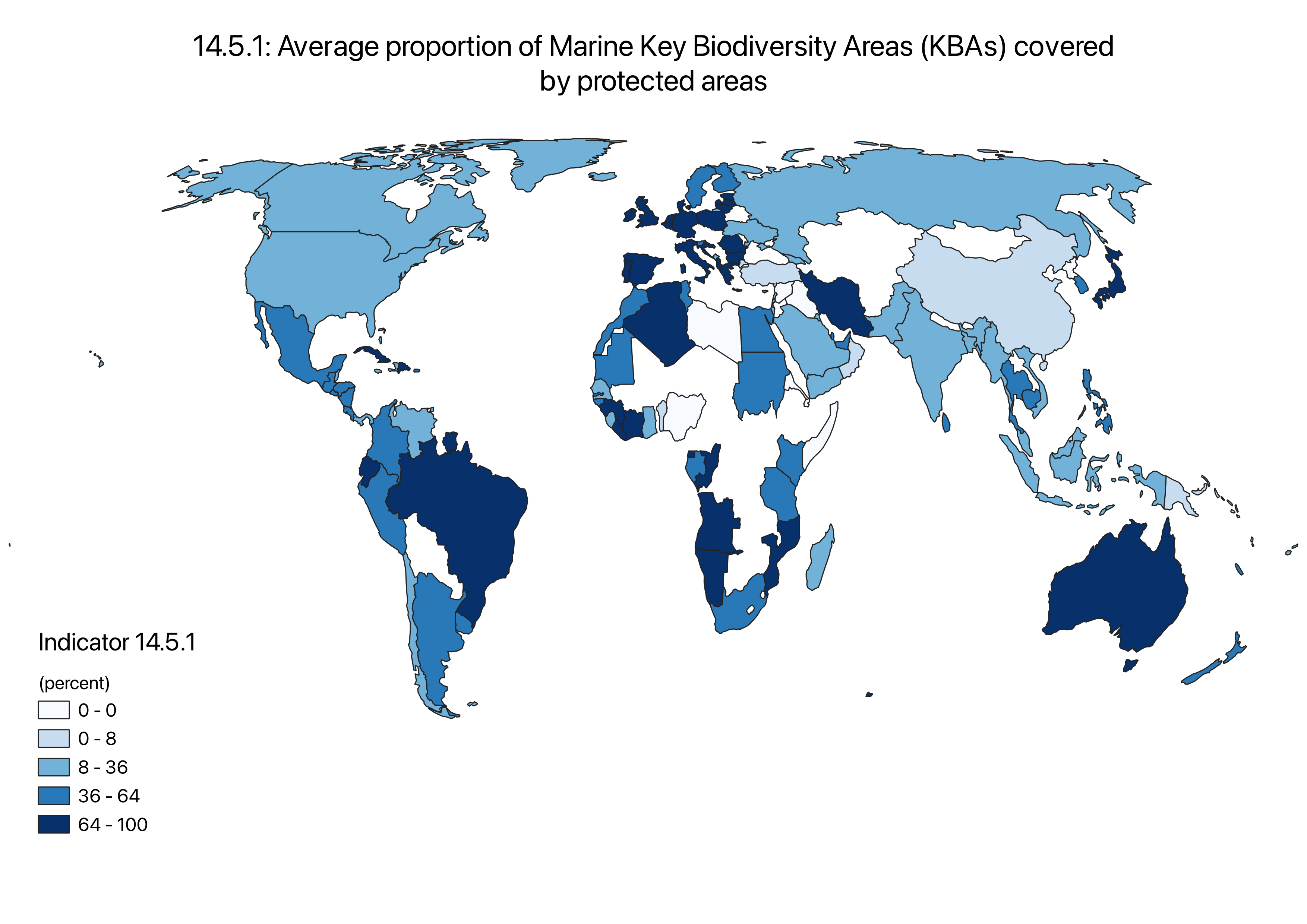
SDG indicator 14.5.1 falls under SDG 14: Life below water, which aims to promote safe and sustainable ocean activity. This indicator also falls under the goal 14.5, stating that “By 2020, conserve at least 10 per cent of coastal and marine areas, consistent with national and international law and based on the best available scientific information.” Ultimately, 14.5.1 looks at the overall marine area in relation to how much of this area is protected.
I chose this indicator, 1) because it had sufficient data to make a meaningful map; and 2) because I thought it was relevant and comparable to the first map (indicator 15.1.1). Both maps look environmental sustainability, but from two different angles. One looks at what is being done on land, and the other looks at marine efforts, offering a more complete view of global conservation.
Skills Aquired: From making this map I became comfortable with QGIS – I mastered previously acquired skills and learned to find my own data and consider relevant factors along this process (such as quantity and quality of data or how maps can morf bias against data based on how it is presented).
Comparison
In an effort to compare these two maps, I uploaded them onto ESRI Online and created a slider webmap – an interactive side by side view of the two maps.
Skills Aquired:Became familiar with ESRI Online (relearning skills I had already mastered on QGIS) and learned how to make an interactive webmap.